Text & Image
Display text, image and headings in a horizontally aligned package
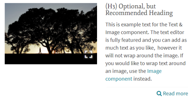
The Text & Image component streamlines the authoring experience. What would take at least 3 separate components to reproduce, Text & Image does in one swoop by combining words, imagery and links into a single package.
Features
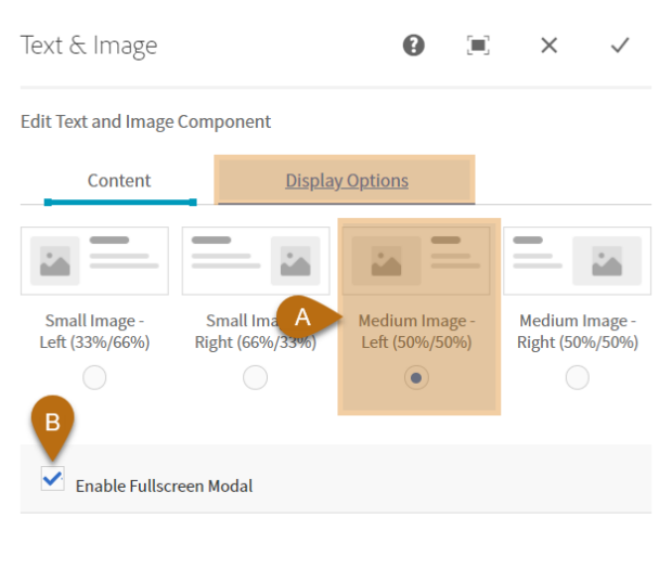
- Image alignment and sizing options
- Full text editor
- Icons or imagery
- Full-screen image toggle
Pro Tips
- Spans to fit column – ideal for medium-large widths
- Use icons in lieu of images, or none at all
- Create content highlights or 'funnels' using headings and links
- Transparent background. Use with Panel Builders to define borders.
- To crop the image, first add, then use the Quick Edit mode (pencil). For presets, enter fullscreen mode
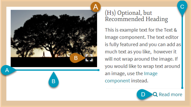
Visual Manual
Align left-column colors with right-column content
Input Fields
Configure the output
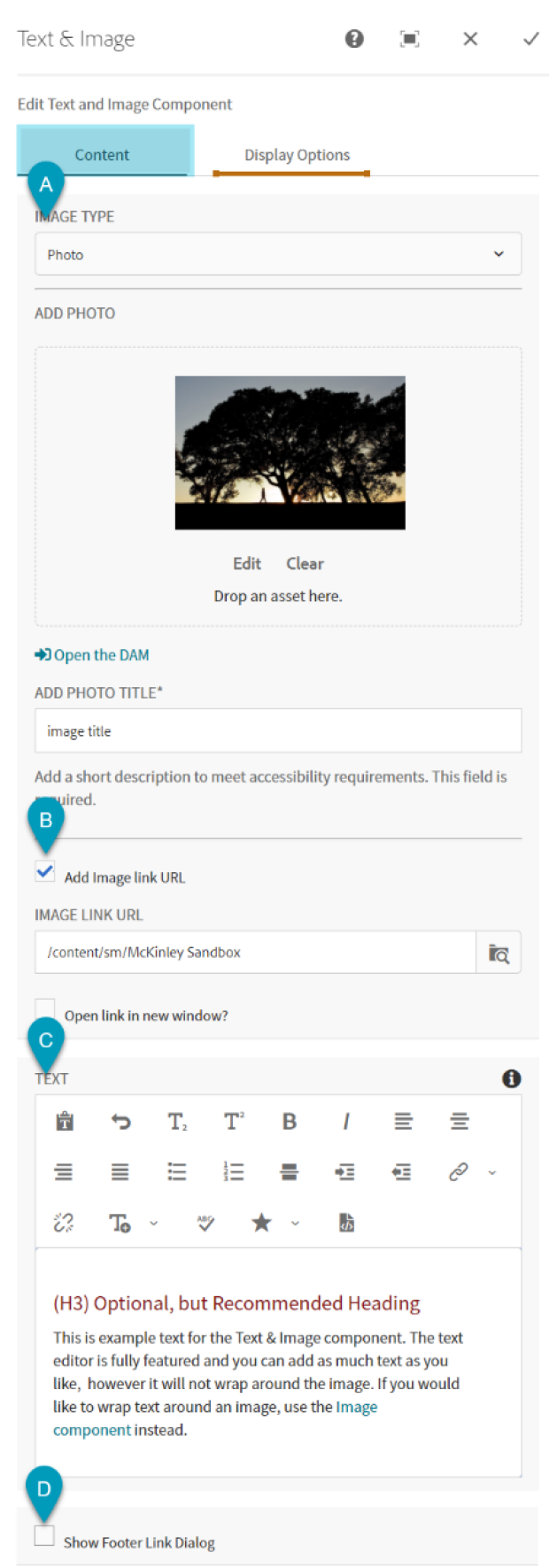
Output Key
Displays the input fields