Tabs
Create areas of horizontally collapsible content
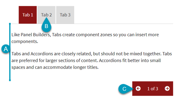
Tabs create areas of horizontally embedded content that with a click of a heading, reveal content. Use Tabs to consolidate content and engage visitors by having them click to reveal what they seek.
Features
- Create up to 10 tabs
- Edit each tab heading
- Choose which tab is open by default
- Tab navigation @ bottom for ease of use
Pro Tips
- Good for sequential steps and processes
- Effective in large groupings and spaces
- Not ideal for narrow panels or long titles
- Using more than 5 tabs can result in a stacked view
- Do not place other collapsible components within
- Anchor link created for each entry
- Switch between entries using Preview mode
Visual Manual
Align left-column colors with right-column content
Input Fields
Configure the output

Output Key
Displays the input fields